There has been a lot of talk and speculation on Air India and its fate with the Dreamliners, but looks like it is all falling into place now. Boeing made a massive publicity stint with bringing the 787 to India Aviation 2012, one painted in Air India livery and ready to be given to the airline once the certification is complete, and Air India and Boeing can settle the tussle over the compensation to be paid to AI for the delay. Yours truly was one of the few invited to have a peep inside, and I gladly took the short hop to Hyderabad to explore what AI and Boeing were cooking up together. The plane made a 14 hour flight from Seattle to Delhi, and then continued to Hyderabad after a day’s stopover in Delhi.
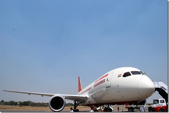
Here is a look at what I saw when I arrived, and took a little walk around the plane as I waited for my turn to go inside.
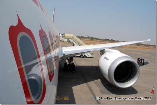
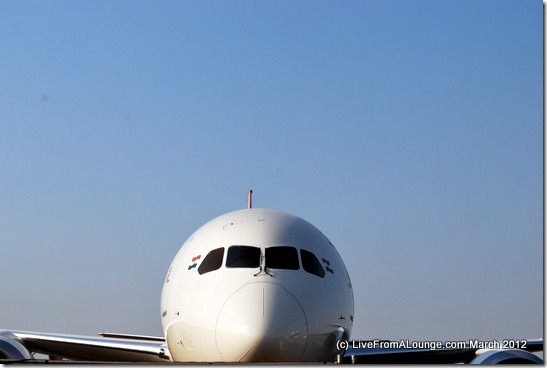
The Boeing 787 Dreamliner at Hyderabad’s Begumpet Airport
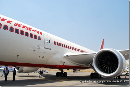
A look on the other side
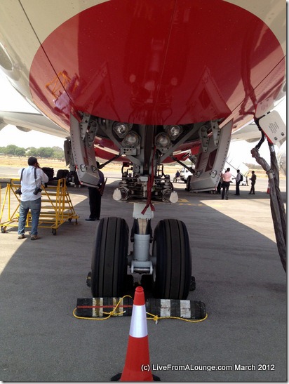
Walking under the belly…
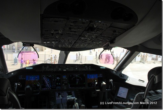
Once we had some space (I was jostling with TV crews and bureaucrats for space inside the plane), I was let in and the first thing I did was to head to the cockpit.
I’ve been to quite a few cockpits but this one was different. Boeing had clearly redesigned the cockpit, and reorganised the panels and the flying experience. However, in the process, they also wanted to keep some similarities. The test pilots who were incharge of this flight told me in a chat that the flight program for the 787 were designed in mind to have something ‘in common’ with the B777 as well, so that there was not a massive new learning curve. So, in theory, a B777 pilot could very well fly the B787 and alternate between the two.
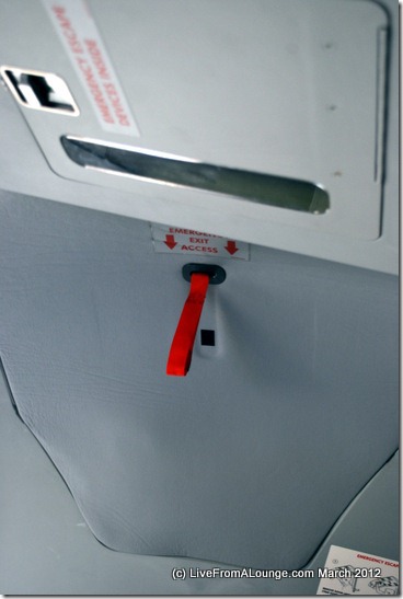
And while I was leaving the cockpit after a nice long chat, I found something interesting in the roof. I was told this was an emergency hatch for the pilot’s evacuation, something I never noticed on another plane before.
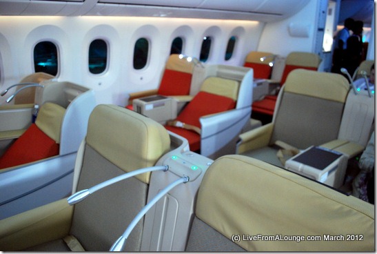
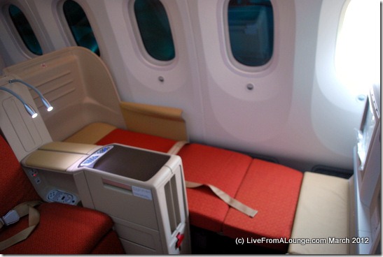
A comfortably functional Business Class cabin for AI’s 787
Once I was done strolling around, I came to the main purpose of my visit. The first look at the 787’s inside for the passenger. Here is what I saw:
A 2-2-2 abreast cabin, with 18 seats in all in Air India’s Business Class
A fully-flat bed offering for the Business cabin
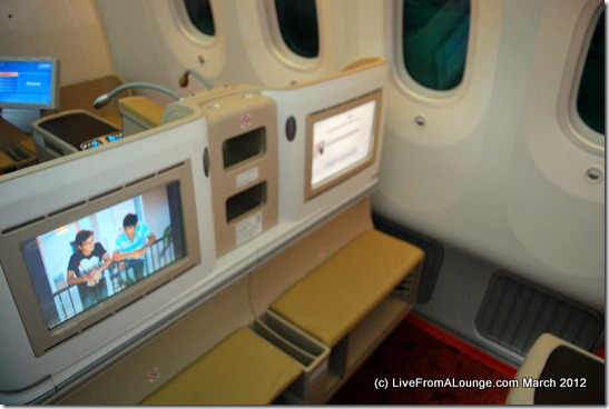
A large IFE screen, however, very distant
To put it mildly, Air India did not go through the hoops to design an innovative product for the 787. They just purchased, perhaps the lowest cost seats, and put them on the business cabin. The seat pitch in business class is nice, at about 74 inches, and very comfortable. I lounged around in those seats for a while and could not complain. However, I found the screens to be too distant from the headrest, and I wondered if that little design aspect was thought through before AI ordered for the installation of the screens in the shells rather than having them built into the seat (like the bulkhead seats!)
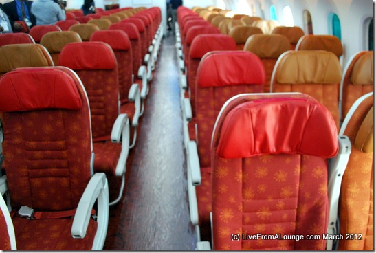
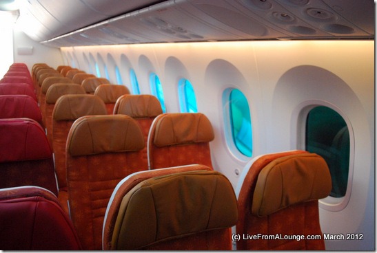
An ugly economy class for Air India’s 787
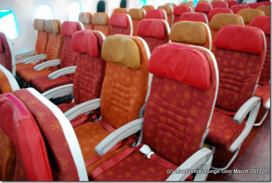
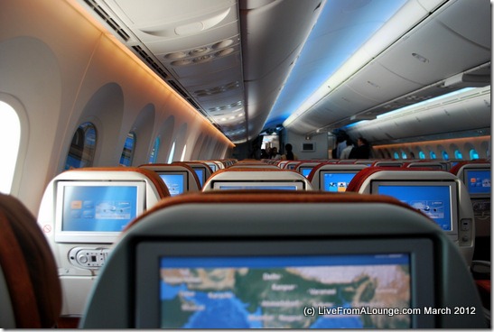
While the 787 is a fantastic plane, sometimes an airline can just mess it up. Here is a first look at Air India’s economy cabin, which will have 238 seats in a 3-3-3 (9 abreast) configuration, also known as bonecrushing for those who have to survive a 10+ hour flight in those seats.
The first thing I ended up noticing was not the legendary windows or the innovative 787 features. Someone in AI wanted to design the plane in Air India colors, and as a result, all the seat upholstery is in random shades of red and orange to compliment the AI colors.
A generous 33 inch seat pitch is what you get for your multi-hour scheduled flights on this plane. However, the colors had me put off.
The wide 787 windows were lined up in all the gradients from full-light outside to dark … Like you would know, the 787 does not have any window shades, so the window has a button underneath, which will tint the window into the gradient you’d like.
The shade-less windows
A look at the economy cabin with the Boeing Sky Interiors on.
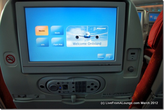
The Air India Boeing 787 IFE
Air India got the Thales i8000 Top Series IFE for fitment on their new planes. Like you saw above, the business cabin gets some very wide screens and there will be in-seat power and USB access for each seat. All the seats in economy will also get a similar offering, with individual power ports for each seat as a standard offering.
What I could not come to terms with the design of the control panel, which clearly could have been sleeker to start with. 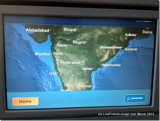
I found my way into the Airshow to see how the location mapping worked, and yes, it looked pretty accurate ![]()
I spent a lot more time inside the plane, and I feel if AI could now make a good ‘re-launch’ with this product and fly it on routes that made economic sense, they had a good shot at making a profitable flight with these planes. I’ve posted all the pictures in a separate album available on our Facebook Page. Head up there for over 30 pictures of the AI 787.
On my way out….
Bye Bye Boeing
So, readers, how do you think Air India’s 787 designs stack up for you? And for those who’ve been on the ANA 787, do you think this compares?
Related Posts:
- I am off to Hyderabad for India Aviation 2012
- Air India proposes a $1 Billion compensation, Boeing disposes in $500 Million
- Album with all the AI Boeing 787-8 Pictures
Live From A Lounge is also present on Facebook, Twitter and available via RSS.


Thank you for the first review. Excellent and very informative indeed!! I thoroughly enjoyed my first flight recently. The seating cover although still orange has uniformity. The interiors are very well maintained. I would say that Air India has done very well since the time they put the Dreamliners in commercial service. Do let me know your views if you have taken a flight sometime recently!
it’s really wonderfull. from the moment i was in the flight i bacame to be so fond of air india. it’s chillin overthere. you must try it……………. have fun all of air india passengers. and wish u …………………. a happy journey. with sweet memories and good comfort.
Lol, it’s appropriate.
Agree with the nasty AI upholstery colors… Only they can make a brand new plane look 10 years old. The creamish exterior paint doesn’t help, makes it look dirty.
Doesn’t look that impressive. 🙁