While the official unveiling of Singapore Airlines’ new A380 cabin products is slated to be tomorrow, over the past twelve hours pictures have started to float about what could be the new version of Singapore Airlines Suites Class.
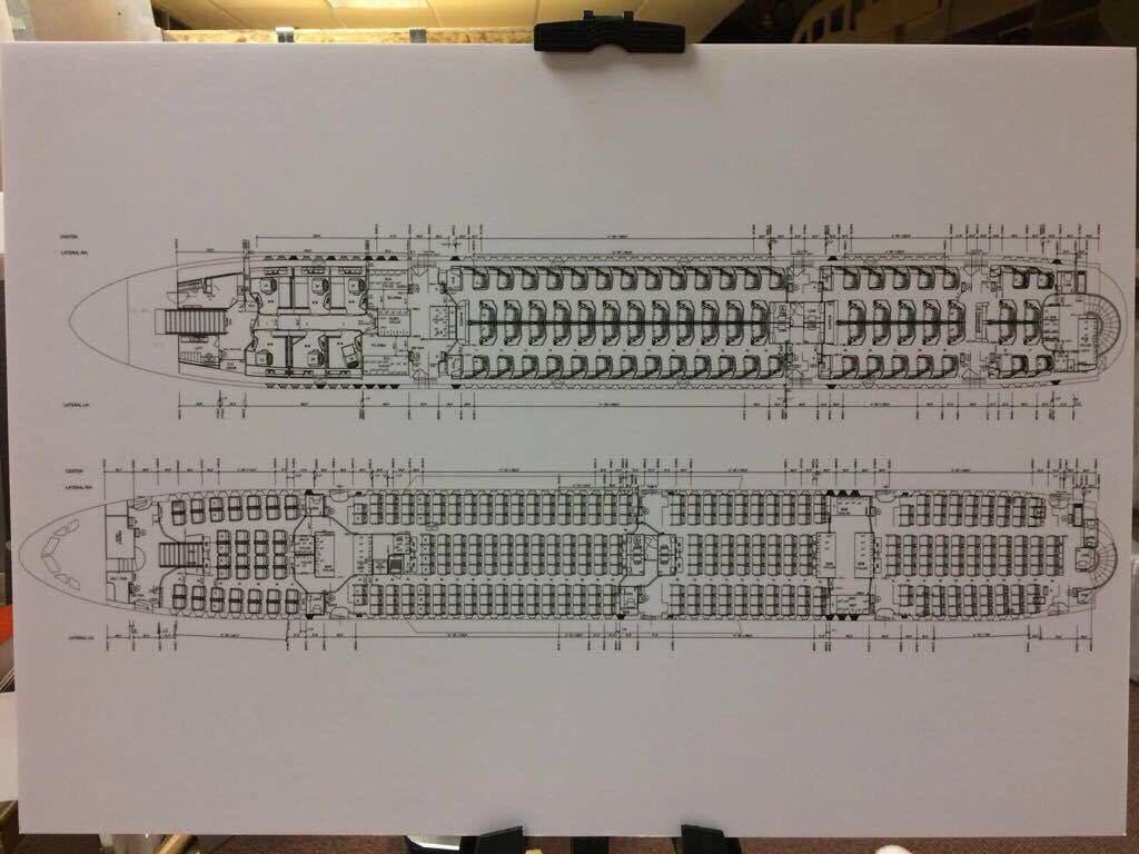
SQ will unveil the product tomorrow and put the first aircraft into service in December 2017. Here is, however, what seemingly looks like the seat map of the new plane. It is interesting to know because SQ is definitely moving up the First Class Suites to the upper deck along with Business Class in the new set up, which gives them new opportunities.
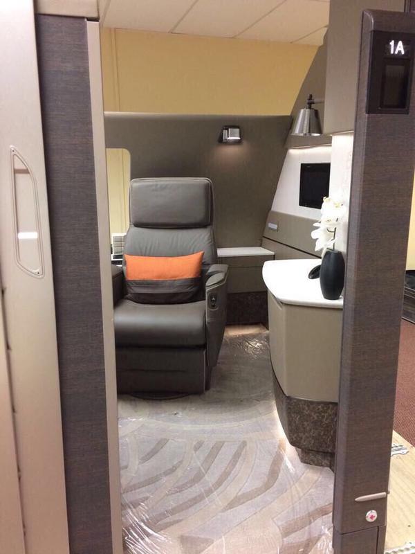
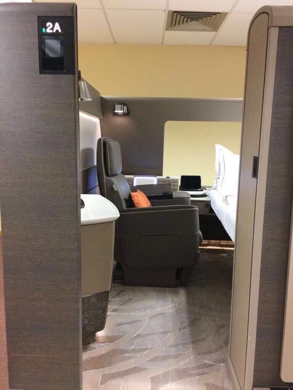
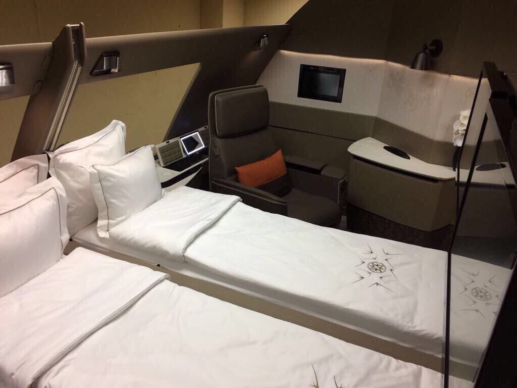
That seat map gives us a lot of clues. First and foremost, 6 Suites is a done deal, which is much lesser than the current 12 Suites layout. Also, given the pictures below, SQ has moved towards a seat + bed concept similar to Etihad’s Apartment.
While most of the suites are for solo travel, SQ hasn’t forgotten the couples as well. Suite 1A and 2A should be able to bring down a divider in between to travel in one big double bed Suite.
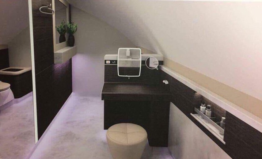
With a swivel chair to sit, one could watch out of the window and/or watch the IFE at the foot of the bed. Not just that, if you wanted to change, a big lav is also there.
Of course, the first things first, the product looks really understated. The colour scheme has moved from rich brown to dull hues and that is not something that at least looks good in the pictures. Of course, I’d have to see it for real to know what is the real deal here.
I’d really hope Singapore Airlines would have a lot more to reveal, but this looks underwhelming. I also know why. The colour scheme is the culprit.
I think these pictures have been snapped from mockups clearly, and there should be more body of information available tomorrow to fill up the rest of the teaser.
In the meanwhile, what do you think about the new SQ Suites?
(H/T: SQTalk)


Leave a Reply