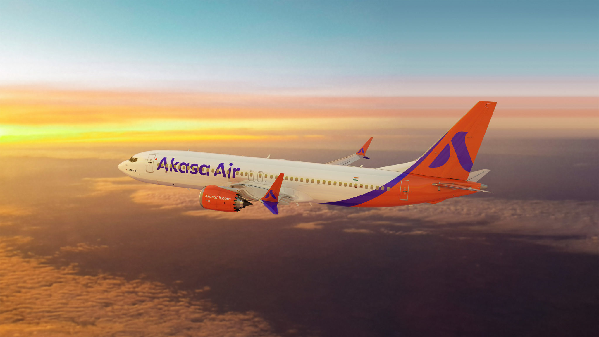
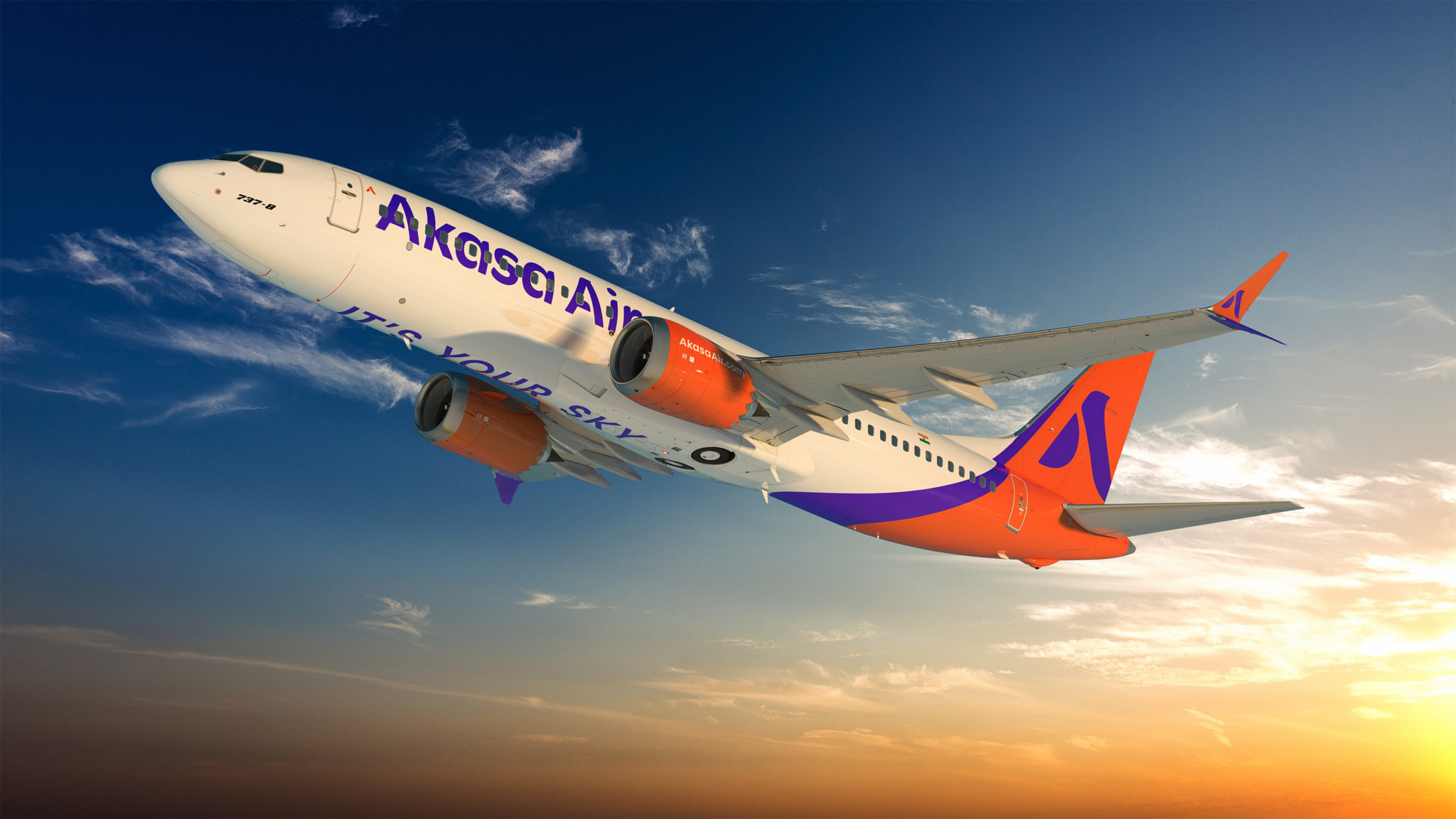
A few days ago, Akasa, announced its fleet plans. The airline is slated to have a fleet of Boeing 737 MAX 8 and MAX 200 aircraft in its fleet. Subsequently, the airline also announced its social media presence and has been dropping cryptic clues for what seems to be its brand story.
Today, Akasa gave us all the answers themselves. They have unveiled their livery.

While I have no clue as to how it will look in real life, thank goodness the airline kept away from the colours red, which have been donned by three different airlines in India already. The brand colors, “Sunrise Orange” and “Passionate Purple” reflect the airline’s warm, youthful, and respectful nature.

Akasa also released a video to tell us their brand story on the occassion.
As per Akasa, ‘The Rising A’, Akasa Air’s symbol, is inspired by elements from the sky. It symbolises the warmth of the rising sun, the effortless flight of a bird and the dependability of an aircraft wing. The Rising A connects aviation and ascension and exudes warmth, dependability, freedom, and motion. It encapsulates the spirit of flying, the aim of height and the pursuit of dreams. The Rising A of Akasa Air. Always moving upwards. Always inspiring to rise.
Akasa’s tagline is It’s Your Sky. As per Akasa, ‘It’s Your Sky’ is the brand’s promise to embrace everyone and to create an inclusive environment for all Indians regardless of their socio-economic or cultural backgrounds. It is a powerful pledge of ownership, promise, and possibilities that accompany each traveller on their journeys.
On this occassion, Vinay Dube, the founder, MD and CEO of Akasa said,
Translating our purpose to serve every traveller with an innovative yet simple alternative required a
modern and confident symbol. The Akasa Air brand identity encapsulates the collective spirit of flying
and the individual pursuit of dreams for each of us.It is our promise to all, regardless of backgrounds or beliefs, that it’s your sky, your
dreams, your passions, and your personal journey, and Akasa Air is honoured to be a part of it.
Belson Coutinho, the Co-Founder, and Chief Marketing and Experience Officer of Akasa Air said,
We wanted our logo to be simple, easy-to-recall and connect with our brand ethos. The Rising A seamlessly connects aviation & ascension and exudes warmth, dependability, freedom, and motion. We believe that the sky embraces everyone and is no longer the limit. To bring this brand identity and promise to life, we are building a youthful, friendly, and dynamic culture of service and excellence, driven by a tech-led and sustainability-led strategy.
The positioning and identity for Akasa Air have been crafted by 26FIVE India Lab, a Mumbai-based brand engagement firm and part of the NYC-headquartered 26FIVE Global Lab creative network.
The website and all their social media handles are live as well now (Twitter, Instagram, LinkedIn, Youtube).
Bottomline
Akasa is fast taking shape and intends to launch in 2022. The airline has picked The Rising A as its symbol and has some smart colours I would say.
What do you think of the Akasa livery and brand colours?
Liked our articles and our efforts? Please pay an amount you are comfortable with; an amount you believe is the fair price for the content you have consumed. Please enter an amount in the box below and click on the button to pay; you can use Netbanking, Debit/Credit Cards, UPI, QR codes, or any Wallet to pay. Every contribution helps cover the cost of the content generated for your benefit.
(Important: to receive confirmation and details of your transaction, please enter a valid email address in the pop-up form that will appear after you click the ‘Pay Now’ button. For international transactions, use Paypal to process the transaction.)
We are not putting our articles behind any paywall where you are asked to pay before you read an article. We are asking you to pay after you have read the article if you are satisfied with the quality and our efforts.


Looks like the old American Airlines eagle but inverted
Looks like an 9W reunion based on the “Co-founders”.
@Rishabh, that is a well-known fact 🙂
Looks similar to the new Accor logo no?
The colours remind me of the old “Indian” Airlines branding.