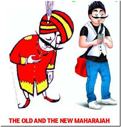
Everyone seems to have picked up the story from the Times of India yesterday, where they gave the spin that the Air India had decided to give its Maharaja mascot a makeover to look more like the common man.
Here is how they portrayed the comparison:
Of course, in the battle of clicks, many stories came out calling this Maharajah hideous. I have to admit he looks hideous, but what the stories conveniently forget to tell you is how there are so many adaptations of the Maharajah and this is just one of them.
Take a look at some of his other adaptations:


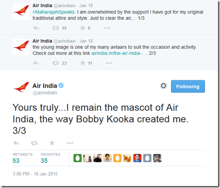
Of course, it was left to Air India to clear up the mess. And they had to go out on Twitter to fix this and issue a clarification:
So, the Maharajah stays as he is, and the hideous look you see above, is just one of his adaptations, which perhaps AI will nix after seeing all this feedback over the internet.
Join over 4000 people who check-in daily to find out about the best in travel.
Free emails (once-a-day) | RSS Feeds | Facebook Updates | Twitter | Instagram


Now he really looks more like a common man, no doubt (even with a cell in his hand) 🙂
Nice meeting your blog, Ajay!
I would love you checking out my photoaggregation project Carde-app dot com, and you opinion about it.
Happy travels 2015! Daria