

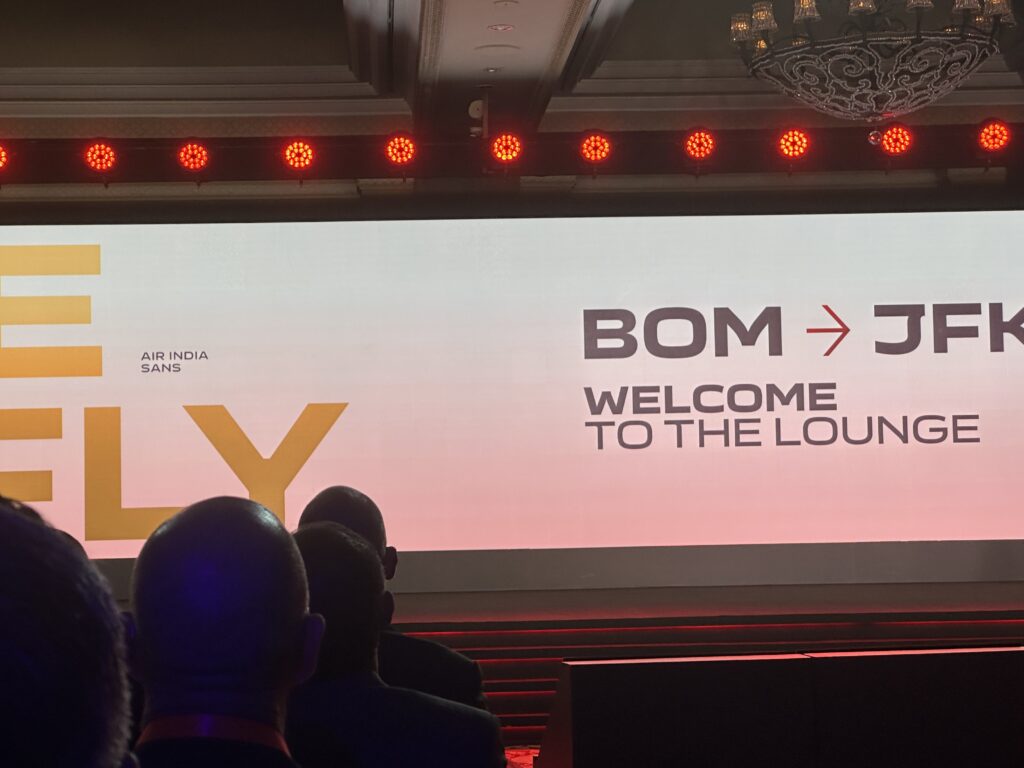
Social media and the news both have been abuzz with the changes coming to Air India. An invitation dropped into my mailbox a few days ago, which did not expressly mention the rebranding to be announced, but hinted at A Window of Possibilities. But yes, it did not need to announce it in as many words to say what this would be about.
Air India’s magnum opus
In an event that was attended by a variety of people, including top brass and HoDs from Air India, Vistara, Air India Connect and Air India Academy, along with representatives from the house of Tatas, both OEMs who power Air India’s fleets, airport operators and the banks who are writing the checks for Air India, the airline last night took the floor to reveal some of the work it has been doing on all the ways the Air India brand identity will be changed over time.
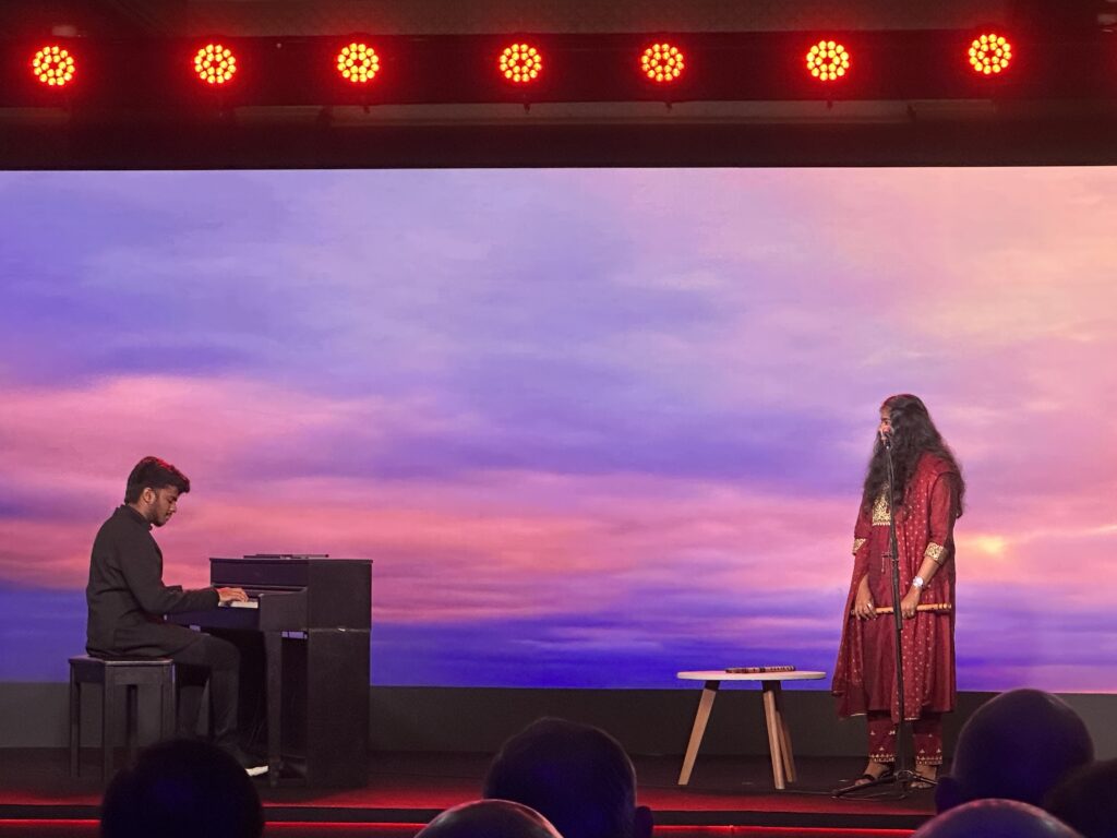
The evening took off with a musical performance, combining the flute and the piano, perhaps an indication of the fusion coming up next (East Meets West? Air India meets Vistara?).
From there, we directly jumped into the reveal of Air India’s new brand identity, symbolically push-buttoned by N Chandrasekaran, Chairman of Tata Sons, and also the board of Air India. Here is the video that was played to announce the launch of the new identity of Air India.
The new Air India logo revealed looks like this.
![]()
The logo unit is basically inspired by the Jharokha or the windows of the palace Air India put on their aircraft back in the day and is called Vista. In the words of the management, it signifies limitless possibilities, but for the layman, it also sounds like they were trying to still catch a break on keeping a connection with Vistara. The airline’s agency, FutureBrand, has in the past handled rebranding for mammoth airlines such as American Airlines and also went on to design a new font for the airline called Air India Sans. [ I woke up in the morning and also thought they tried a bit of British Airways’ Speedbird but turned it into a parenthesis?]
This is not new, and many premium airlines have had their own fonts, such as Emirates and Jet Airways.
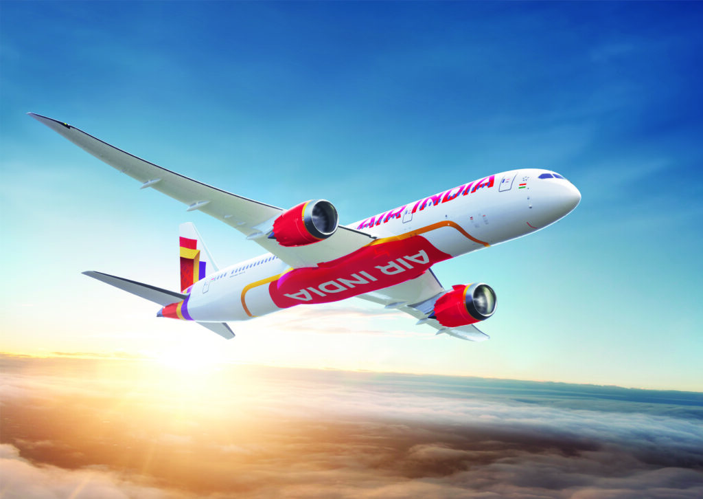
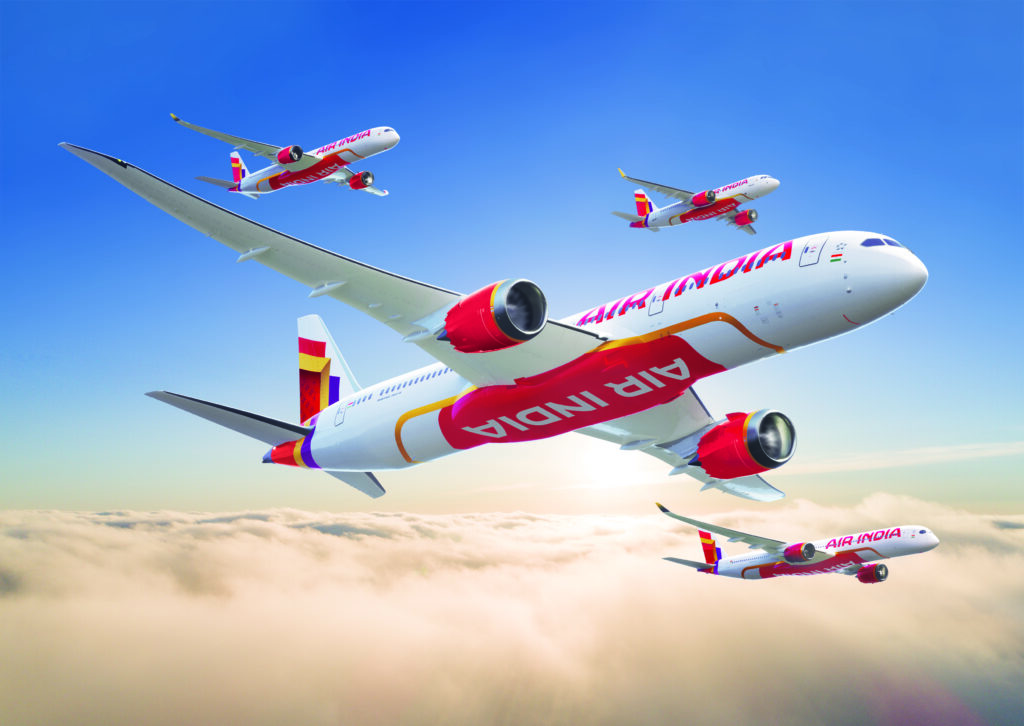
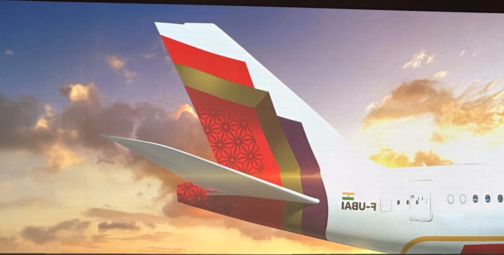
The airline then revealed its livery, which will be first painted on the new aircraft coming from the factory line (the A350-900) and then rolled out on earlier aircraft as well at some point in time. I’m sure you’ve seen it already on social media, but here it is, rendered from various angles and on various equipment types. 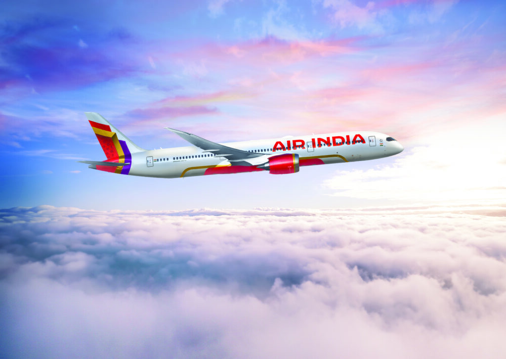
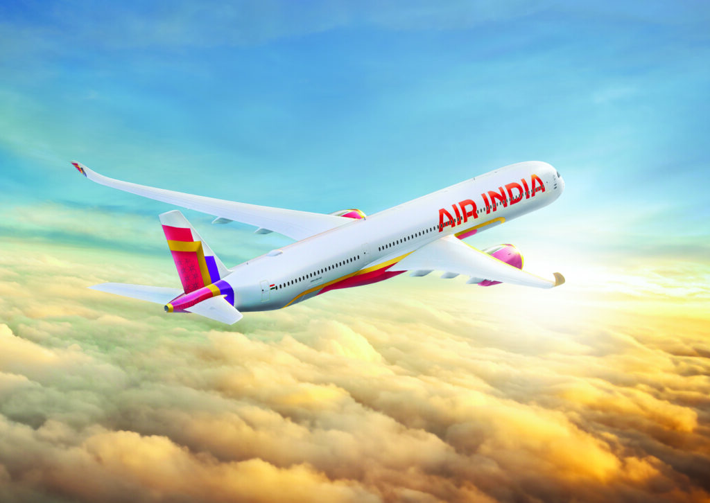
There will also be underbelly branding.
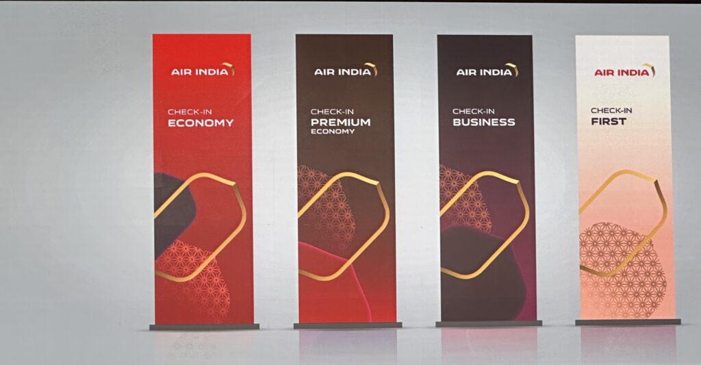
There was also a mockup of the aircraft cabin classes, which will be retrofitted on the Boeing 777-300 ERs. As per Air India, they will keep the four-class cabins on these. I’ll cover that separately, but here is a quick look. [Update: All the details about the 777 retrofit, here]
The @airindia cabins coming up next 👇
F,J,PY, Y pic.twitter.com/Lx6zzCJpc8— Ajay Awtaney (@LiveFromALounge) August 10, 2023
Chandra, as N Chandrasekaran is referred to in the top echelons of the Tata Group, said that Air India was not just another business for the group but a passion.
Going behind the brand…
The Air India brand and livery has honestly been a subject that everyone seems to have had an opinion on, be it customers, airline professionals, or just those who are by standing. So when the new reveal came out, many opinions came out with it, such as it being done in MS Paint, or it being inspired by others and so on.
The new Air India logo looks like what happens when you ask a middle schooler to make their first solo project in MS Paint and the new livery is what happens when you have them drop acid first
— Shiv Ramdas Official Boye Mafia Spokesman (@nameshiv) August 10, 2023
Same, same, but different pic.twitter.com/qgh06C8Z0K
— Danny Lee (@AirEVthingTRNSP) August 10, 2023
But there is much to unpack about what Air India is trying to get to. The combination of Red, Burgundy, Aubergine and Gold intends to bring out the four-class configurations that Air India will use, and these colours will go on to signify the various cabin classes over time.
The livery would always be controversial, so damned if they do and damned if they don’t. Having said that, it is the most identifiable part of an airline’s identity, and yet anytime it changes, people don’t seem to like it at first. Personally, I like the new AI livery, and I hope it turns out better on the aircraft rather than the CGX. Ultimately, the thing about liveries is that they grow on you.
Some of the things that I like about the new livery is that it is clean from the top. A white logo unit. That is all.
But there are things that bother me as well, and that list is technical, rather than hating for the purpose of hating on Air India.
- A good feature of the current Air India livery was that it also had Air India painted in the Devanagari script on one side of the aircraft. I will miss that on the new livery. If Air India does not want to put it on the top half of the plane, it could totally go under in the belly branding.
- The tail design is too busy and in the process, misses out on an organic logo unit (the Vista) which should be the standout feature. That jaali design work looks a lot like the detailing on the ITA Airways tails, which in turn looks a lot like Louis Vuitton branding to me.
- There is too much gold on the plane. I mean, why do we need it at the bottom of the plane especially when it is not doing much?
- The belly branding is going to cost too much paint? How about a Red on White instead of a White on Red there, for instance? Also, too much red looks very much inspired by Emirates.
- Also, I see a livery for the A350, the A320, and the 787, but where is the livery for the 777X?
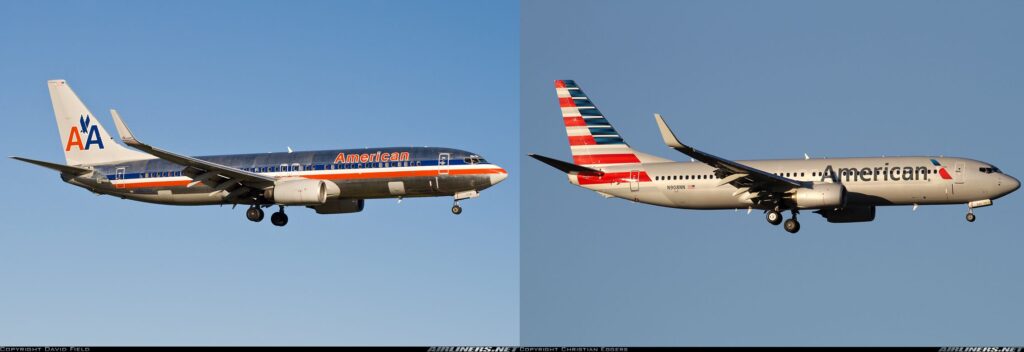
Ultimately, if you look at the previous body of work of Future Brand, they don’t seem to go fully away from the past, so they modernise the past. For instance, on the American Airlines project, the Eagle stayed on in a much more evolved manner.
In that sense, this update is more evolutionary than revolutionary. Future Brand tries to bring together the best of Vistara’s Aubergine / Gold and Air India’s reds and make it fly. It hopes to keep many people happy.
Eventually, I’d rate the logo a 4/5 and the livery a 3.5/5. I might just go over/under, depending on how it turns up finally on a plane. But also remember, unless you are willing to go bold, such as RiyadhAir with its all dark purple livery (which will also not be the primary livery for RiyadhAir), you will perhaps see an equation somewhere else already. For instance, Akasa Air, people were looking at the similarities with Indian Airlines in it.
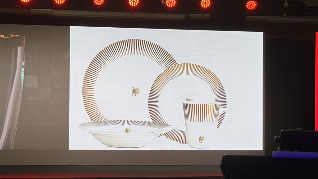
One of the last announcements made by Campbell Wilson, though, was in Steve Jobs’ one last thing tone. He mentioned that the rumours of the death of the Maharajah are deeply exaggerated, only to bring back the Maharajah on the silverware and service elements of the airline.
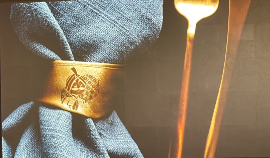
Now, that is the part I sort of don’t agree with at all. The Maharajah seems a force fit here to me, and the china reminds me more of Jet Airways Premiere x Kingfisher Airlines than Air India.
The Boo Boos
Organising landmark events mean a lot of people need to be kept happy. Eventually, I found some detailing missing from this one, which would be something JRD would not have appreciated from whatever I’ve heard of him. From the missing 777X in the fleet to the hearty helping of Aubergine, there were things that could have been done better. Back in the day, Apple used to do mock dry runs to lock down what needed to be said and to what detail to a T before sending out people on their big release events. [Now they just do recorded videos]. Some of that may be needed here.
Out there, Air India put out the logo before the event even started by virtue of a technical snafu at their end. Then, the webcast link went private mid-event as per people who were watching. But what I missed the most was that no one from the frontline was around. An event like this is a great place to bring the cabin crew and other frontline staff to the stage, and every premium airline, such as Emirates, Etihad, Qatar Airways, Singapore Airlines and many more, do that. Here, they were forgotten. It would have been a great place to pay homage to the people who stand behind the brand.
Another missing element was the mockup of the seats. When Vistara did a reveal back in 2014 (incidentally at the same location), they organised mockups of the seats for everyone to try out. A missed opportunity to showcase to partners and media what to expect in the future.
Coming back to the detailing. There is a controversy brewing on the internet about what F-UBAI (the registration on the plane that is shown in the CGX) stands for. The real interpretation is Future Brand x Air India. But they could have just done without one altogether because now folks are trying to equate it to Dubai, and that is really uncalled for.
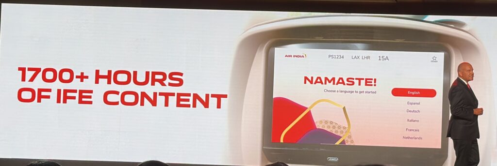
Another one was about the details of the seatback entertainment, where the flight number reads PS 1234, which is used to designate Ukraine Airlines. Also, Air India does not operate between Los Angeles and London Heathrow as denoted.
And as I turn in for the day/night (it is about 4 AM IST), I note that while there is a big reveal, someone forgot to actually use the logos and the assimilated design on the website and social handles to start with.
Bottomline
Air India has revealed its new look, designed by Future Brand, a brand consultancy that has previously handled design work for American Airlines and Fiji Airways. The new logo, called the Vista, takes inspiration from the Jharokha windows on earlier aircraft. The new colours of Air India are a mix of Red, Gold and Burgundy. Air India also revealed a new livery on the occasion.
What do you think of Air India’s new brand strategy and looks?
Liked our articles and our efforts? Please pay an amount you are comfortable with; an amount you believe is the fair price for the content you have consumed. Please enter an amount in the box below and click on the button to pay; you can use Netbanking, Debit/Credit Cards, UPI, QR codes, or any Wallet to pay. Every contribution helps cover the cost of the content generated for your benefit.
(Important: to receive confirmation and details of your transaction, please enter a valid email address in the pop-up form that will appear after you click the ‘Pay Now’ button. For international transactions, use Paypal to process the transaction.)
We are not putting our articles behind any paywall where you are asked to pay before you read an article. We are asking you to pay after you have read the article if you are satisfied with the quality and our efforts.

IMO, I really like the Air India font. Ignore the big screen at the reveal but when you saw the podium from different angles, it looked modern but also a hint of the 60s in it as well!
It’s chunky but clean. Modern yet has a charm that reminds you of the so called glory years of 60s.
The “vista”… hmm, I’m not so sure about that. I can see what they have tried, and I think it would have been fine for wider advertisement on the ground (check-in, lounges, website, app, etc) but on the tail, it may grow on me but looks far too generic to me.
Personally, I’ve got no problems with a livery on the outside and a totally different theme inside the aircraft. If you cast your mind back to the Singapore 747-400s, it had the classic livery outside but totally different colour scheme inside especially in Economy.
Overall, I think it’s a bit of missed opportunity and makes Air India another generic international airline.
Well so after reviewing the livery and the cabin upgrades I have a mixed feeling about this.
The livery IMO, was copied straight from Iberia and Emirates (the font and the underbelly)
And if an airline wants to change it’s livery, it needs to be an upgrade..
Is the new livery necessarily an upgrade over the current one ? I’m not so sure.
I mean, if this is what the branding agency came up with after 15 months and the Tatas spending a lot of money then I’m not sure if that classifies as success.
Moving on to the cabin refurbishment, I think we can all agree that the cabins were in dire need of sprucing up (especially on the 777s) and I think here the airline has done very well.
The F and J class products look really elegant and aesthetically pleasing and a far greater upgrade over what is there currently.
Also I noticed that in Economy class there were seats in a 3-4-3 configuration..
Is the airline planning to make economy 10 seats a row ?
You missed commenting on the registration number on the plane — F-UBAI…
@SS I did say it was a useless needless controversy perhaps due to oversight.
Yes sir!
The Flying Returns programme still sucks. I tried booking a rewards ticket from NY to Delhi for my son, and the payment went through three times, but the ticket did not get generated.
I called Air India, and they said your account is “Primary Active” and not “Active” so I can only book for myself. I asked why, and was told you have to take five flights on Air India in a year to change your status to “Active”, which then allows you to redeem for family and friends.
I said this includes Star Alliance flights and I’m at seven so far, but they said it’s only Air India.
I had to get into the web site, find the relevant terms and conditions and then get them to admit they were wrong. And as with all things Air India, it takes 48 hours to change anything…
What’s the lame explanation? The system was updated in May…and the payment will eventually come back on the card…
First proper summary of the big reveal! I do agree, the tail has a busy design, and seems disconnected from the rest of the livery whilst the underbelly is overdone. The gold ring on the engines could have been avoided. The red colour also seems to vary based on the image you see. Thank you, Ajay, for your analysis, it’s right on point.
Very nicely articulated. I really miss the Indianness in this branding. The devanagari script missing is a blunder and so is the maharajah from the prominent branding spots.
Pretty putrid livery. Only the Tatas could goof up an inconic livery and mess it up so bad
The new logo is beautiful, simple, elegant and it evokes the cultural richness of India.
But the livery, oh my goodness ! This bariolage and mix of mismatched colors not seduce the eye, the useless underbelly branding attracts the eye down and destroys the harmony of the whole. They should do something simpler and more striking by using mainly the new logo. A reminder of Indian colors would also be welcome. This is my opinion.
Hi Ajay, Great Review of the Air India event! Agree with you on all the points! Hope their top management notices
I don’t think anyone in the decision making circles bothered to check if Vista has a meaning in Sanskrut / Marathi.