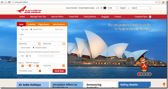
Air India has launched a good-looking website just yesterday, which seems to be a huge step-up from their previous effort which looked totally unprofessional to me.
Like is the usual, their two emblems are right there: the swan logo and the Maharaja, who is their mascot. And while all this make over looked nice, when you go to make a reservation or try logging into the frequent flyer program, you’d notice that things are still the same, because that is powered by SITA and hosted externally.
Let me know how do you feel about the new Air India website in the comments section.
Related Posts:
Live From A Lounge is present on Facebook, Twitter & available via email, RSS.


Agree that the makeover is only cosmetic. But as long as its not buggy, I’ll take the new look for a change.
I’m sure the AI webmasters had to go through a lot of bureaucracy and red tape in order to approve a website redesign! 😀